Last updated: 7 October 2026
Choosing colours is the part of decorating people enjoy most and worry about most. It doesn't have to be guesswork. A few simple ideas, a colour wheel, some tried-and-tested schemes and a bit of attention to light will get you to a palette that feels right and holds together from room to room. Try the colour studio below as you read.
Try it in the colour studio
Pick a colour on the wheel, choose a scheme, then see it on a room.
Blue-green
Real rooms vary, so test a sample in your own light.
- WallsSoft teal#B5D9D7
- AccentDusty teal#3B9B96
- Deeper toneDeep petrol#2F6A66
- TrimSea mist#EDF3F2
Colours on screen vary, so always test a sample on your own wall.
Find your palette
Four quick questions. Your answers stay on this page: nothing is stored or sent.
Start with the colour wheel
Painters use a wheel of twelve colours. Red, yellow and blue are the primaries. Mixing two of them gives the secondaries: orange, green and violet. Mixing a primary with its neighbouring secondary gives the six in-between colours, such as blue-green and red-orange. The wheel is useful because position tells you how colours behave together: neighbours sit comfortably side by side, and opposites make each other look brighter.
Four simple ways to build a scheme
- One colour, several tones: use lighter and darker versions of a single colour. It's the easiest route to a calm, put-together room, and the basis of colour drenching and capping.
- Neighbours: pick colours that sit side by side on the wheel, such as blue, blue-green and green. The result is gentle and easy on the eye.
- Opposites: pair colours from opposite sides, such as blue and orange. It's lively and bold, so use one as the main colour and the other in small doses.
- Three evenly spaced colours: choose three spaced equally around the wheel. It's playful and energetic, and works best when one colour leads and the other two support it.
Warm, cool and undertones
Reds, oranges and yellows feel warm and cosy, while blues, greens and violets feel cool and calm. But almost every paint colour has an undertone that leans one way or the other. A grey can lean blue, green or pink, and a cream can lean yellow or pink. Undertones are why a colour that looked perfect on a card can look slightly off in your room. Compare your colour with your flooring, curtains and furniture, and check the undertones sit comfortably together.
How light changes everything
A north-facing room gets cooler, flatter light, so colours look slightly bluer and darker there, and warm shades are often a good fit. South-facing rooms get warmer, brighter light, which can wash out pale colours and flatter cooler ones. Artificial light shifts things again: warm bulbs add yellow and cool ones add blue. Always look at a colour in daylight, in the evening and with your lights on.
A simple rule for proportions
If you're mixing colours, a classic rule of thumb is 60-30-10: around 60 per cent of the room in a main colour, 30 per cent in a second colour and 10 per cent in an accent. The main colour is usually the walls, the second might be the larger furniture or the curtains, and the accent is cushions, art or a single painted piece. It stops a scheme from feeling busy.
Making rooms flow
Think of your home as a series of rooms you walk through. Hallways, stairs and landings are the connecting thread, so they usually work best in a calm colour, or one shared with the rooms they lead to. Upstairs and downstairs can have different personalities, and bedrooms, a home office and a child's room might each want a different mood. Where two rooms connect, use different tones of the same colour, one a little lighter than the other, so the move between them feels natural.
Don't forget the ceiling and woodwork
White ceilings and woodwork are the default, but they're a choice, not a rule. A ceiling in a softer or deeper tone of the wall colour makes a room feel cosier, and painting the woodwork the same colour as the walls can make a room feel seamless. If that appeals, read our guide to colour drenching, and try both in the studio above.
Test before you commit
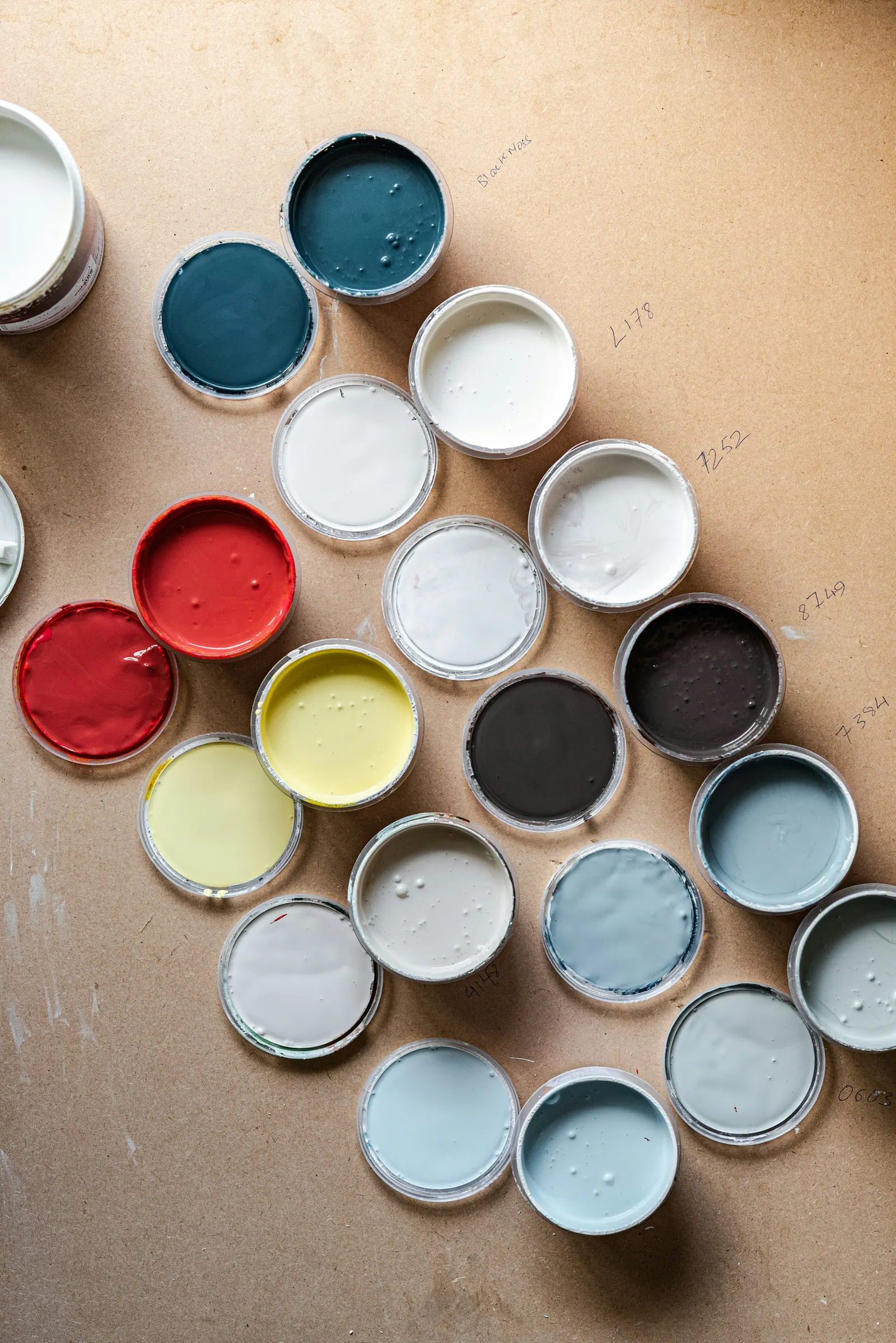
Don't choose from a small card. Paint a large sample on two different walls, at least the size of a sheet of A3, or paint a sample on lining paper you can move around the room. Look at it in the morning, afternoon and evening, next to your flooring and furniture, and live with it for a few days. Check the finish too, because a matt and a satin in the same colour look different.
Where to start
Start with what you can't easily change: the flooring, the kitchen, a sofa or the curtains. Then pick one room, ideally the one you use most, and settle that first. It becomes the anchor for the rest of the house, and every other room is easier to choose once you have one colour you love. Seeing colours on a real wall, in your own light, is the best way to decide, especially in homes across Sutton Coldfield where light and room sizes vary a lot.
Not sure which colours suit your home? Use the quote form to tell us about the room, and attach photos if you can. We'll talk through colour ideas as part of your free written quote.